|
||
|
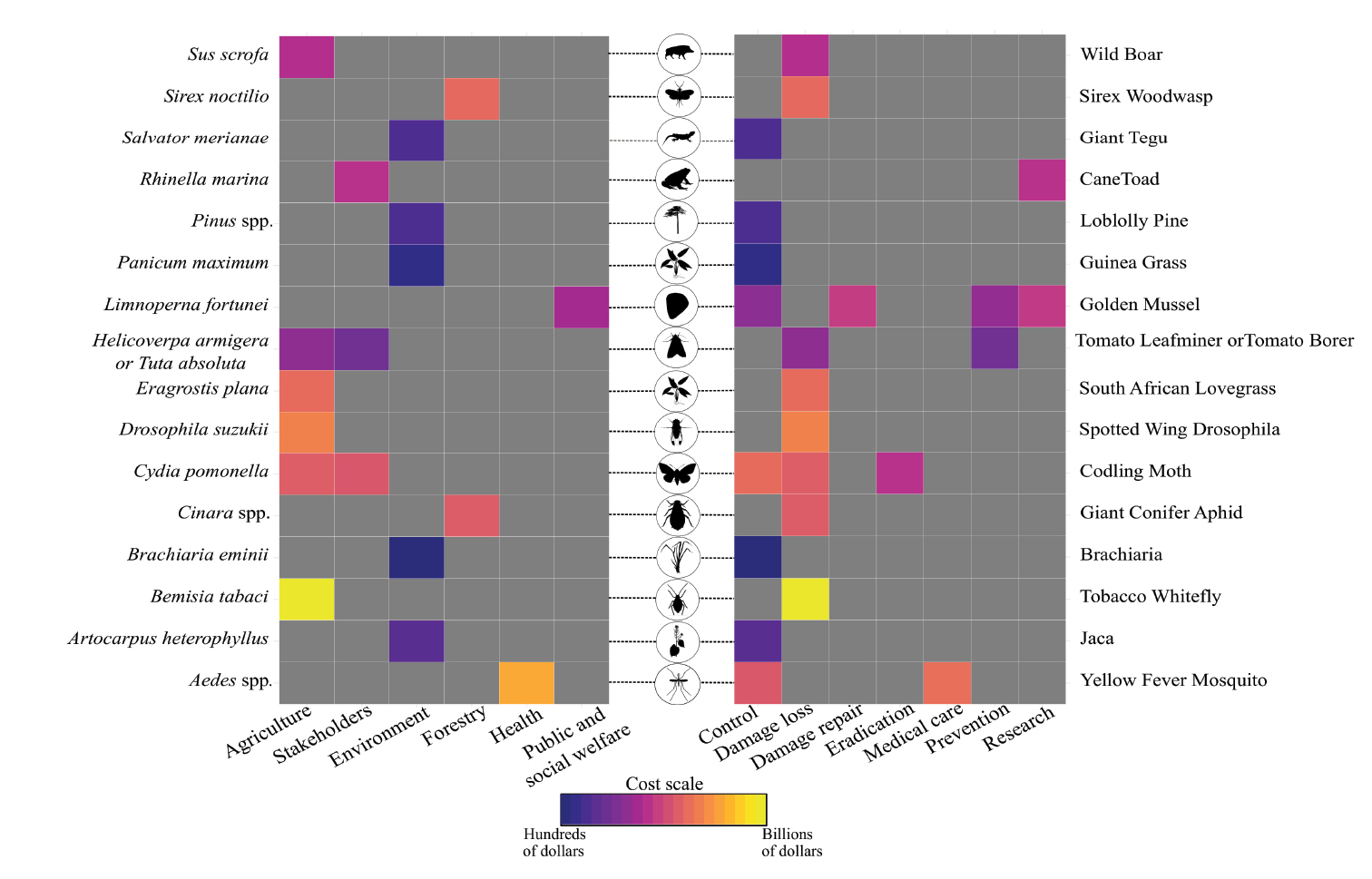
Heat map depicting the economic costs associated with species, market sectors and cost type. Each block indicates the cost incurred by each species over a specific market sector (in left) and cost type (in right). Gray blocks are associations with no available cost information and colorful blocks indicate the intensity of the economic cost incurred by each species. Low cost intensity (i.e. hundreds and thousands of dollars) are represented by blue to purple color transitions and high cost intensity (i.e. billions of dollars) are represented by orange to yellow color transitions. The remaining colors represent intermediate cost intensity (i.e., millions of dollars). Each row of the heatmap corresponds to one species and the species name and its vernacular name are depicted in the left and right margins of the heatmap respectively. Each column of the heat map corresponds to an impacted market sector and the type of cost required to overcome invasive species impact. The circles in the middle depicts a visual representation of invasive organisms. All silhouettes were freely obtained from www.phylopic.org. |